Personalized Health Monitoring and Advisory Solution
Role : UX / UI Designer from research to high fidelity design
Timeline : 2023 - 2024
Problem Statement
In light of the alarming statistics presented by PAHO, the pervasive challenge of NonCommunicable Diseases (NCDs) in Trinidad and Tobago becomes evident. These diseases account for a staggering 62% of annual deaths, underlining the urgent need for intervention.
Despite commendable efforts by the Ministry of Health to spread awareness about NCDs and healthy living, a critical issue emerges. Individuals must navigate a sea of information, unsure of the validity of the information, to unearth content relevant to their specific circumstances. This fragmentation obstructs the path to informed choices and healthier lives.
This stark reality demands an innovative solution that consolidates and distributes personalized health information, bridges the gap between the Ministry’s initiatives and public engagement, and empowers individuals to make informed choices for a healthier future.
The Proposed Solution
In addressing the critical challenges posed by
non-communicable diseases (NCDs), our
proposed solution, referred to as
"HealthConnect TT," emerges as a visionary and
dynamic platform poised to make a significant
impact. This comprehensive solution is
meticulously crafted to provide personalized
health monitoring and advisory services to the
population of Trinidad and Tobago.
By leveraging cutting-edge technology, HealthConnect TT aims to bridge crucial gaps in the dissemination of medical updates, lifestyle information, and health-related insights.
The following sections outline the key features and strategies encapsulated in HealthConnect TT, emphasizing user-centric design, real-time health
updates, and innovative functionalities that collectively contribute to a transformative
approach in promoting public health and well-being.


User Interviews
To gain deeper insights into the needs and pain points of potential users, a few interviews were conducted as part of the UX case study. The interviews involved individuals from diverse backgrounds, including those who have personally experienced issues with their health due to NCDs in Trinidad and Tobago.
By conducting these interviews, valuable firsthand information was obtained, allowing for a more empathetic and user-centered design approach.
These user research interviews served as a foundation for the design process, informing the decision-making process at each stage.
Pain Points from the user interviews
Information Overload
With the massive amounts of NCDs and the information related to them, Users expressed concerns with being bombarded with too much information.
Privacy concerns
Users expressed issues with wanting information about NCDs but not wanting to share any information about their health or personal information.
Usability concerns
Users expressed concerns about accessibility due to having issues with technology or disabilities.
Ministry of Health Insights
In addition to engaging with potential users, meaningful insights were also gleaned through conversations with Ministry of Health stakeholders. These discussions provided invaluable perspectives on internal processes, challenges, and opportunities within the organization. By collaborating closely with Ministry of Health, we aimed to gain a comprehensive understanding of their operational needs and pain points, ultimately shaping a solution that addresses both user and organizational requirements.

Pain Points from the conversations with Ministry of Health
Information Dissemination
The need for their information about NCDs to be more readily available to the public was expressed by the MOH.
Ease of updating
The MOH expressed a need for the updating of content on the application to be seamless, usable and efficient.
User Adoption
The MOH expressed a desire for the features of the application to encourage the public to use the app as well as retain the users on the app.
User Personas
To deepen our understanding of the diverse needs and preferences of our target audience, we have developed user personas based on insights gathered from user interviews and stakeholder conversations. These personas represent archetypal users who engage with the Ministry of health and Health initiatives and provide valuable insights into their behaviors, motivations, and pain points. By personifying our users, we can empathize with their experiences and tailor our solution to meet their specific needs effectively.
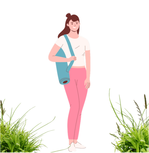
Emily - The Busy Health Enthusiast
Background: Emily, 30, is health-conscious and
proactively manages her well-being. She does not
have any NCDs and wants to ensure that it stays
that way as her grandmother has diabetes and she
wants to take as much preventative care as
possible.
Goals & Needs: Her main goal is to get up-to-date
information about diabetes so that she can be
more aware of the symptoms revolving diabetes in
order to know what to look out for. She also wants to have the information so that she
can better take care of her grandmother who struggles with diabetes.
She requires a user-friendly application that she can navigate through quickly to fit into
her busy lifestyle. She does not want to have to sift through any information that isn’t
about diabetes as she is a very busy woman.
Challenges: Managing multiple health apps, she desires a centralized solution for
holistic health tracking. She uses one app to manage her workouts, one app to
manage her macros when eating and another app to keep track of any symptoms she
may have or any measurements she takes for monitoring her health.
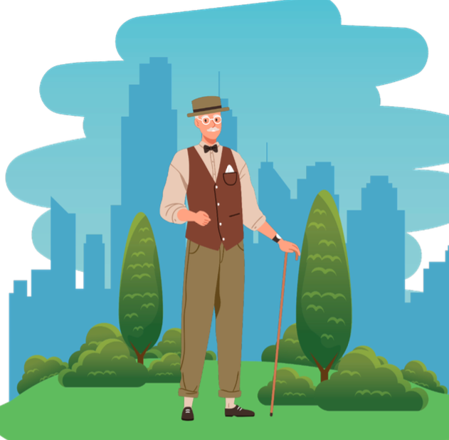
John - The Senior Citizen
Background: Mr. Johnson, 70, values simplicity
and struggles with technology. He has high
blood pressure and takes hypertension
medications daily to manage his ailments. He
often forgets to take his medication at the same
time everyday as he is becoming more forgetful
and also writes his blood pressure
measurements in an old notebook that he often
misplaces.
Goals & Needs: He needs to be reminded about taking his medication at the same time everyday. He also needs a more reliable place to store the
measurements of his blood pressure when he takes them. John’s main requirement is
that the solution is simple to use so that he does not have to bother his family
members every time he needs to use it.
Challenges: Navigating complex apps, he needs an intuitive platform tailored to his
age-related needs.
Key insights to consider when designing
User-Centric Design
Personalization for users
Anonymous Viewing
Features for user retention
Competitor Analysis
HealthConnect TT enters a competitive landscape dominated by well-established health and fitness applications. Here's a comparative analysis highlighting key differentiators and areas of focus between HealthConnect TT and four major players: Google Fit, Apple Health, Samsung Health, and MyFitnessPal.
Google Fit:
Strengths:
Seamless integration with Android devices.
Robust fitness tracking capabilities.
Weaknesses:
Limited personalized health advice.
Interface can be overwhelming for some users.
Apple Health
Strengths:
Ecosystem integration with Apple devices.
Comprehensive health data aggregation.
Weaknesses:
Limited customization options.
May be less accessible to non-Apple users.
Samsung Health
Strengths:
Integration with Samsung wearables.
Diverse health and wellness features.
Weaknesses:
Compatibility issues with non-Samsung devices.
Complex interface for some users.
MyFitnessPal
Strengths:
Extensive food and exercise tracking.
Large community for motivation.
Weaknesses:
Focus on fitness may overshadow overall health.
Limited personalized health insights.
Key Differentiators for HealthConnect TT:
Enhanced Accessibility Mode:
HealthConnect TT ensures a personalized and user-
friendly experience for individuals of all generations by allowing the switch to an
Enhanced Accessibility Mode for the application which facilitates technological literacy
issues, mobility issues and visual impairments.
Comprehensive Health Monitoring:
Unlike many competitors, HealthConnect TT
goes beyond fitness tracking, offering a holistic solution that includes personalized
health advice, medication reminders, and real-time health updates.
Simplicity and Accessibility: HealthConnect TT prioritizes a simple and accessible
design, catering to users with varying levels of technological proficiency.
Conclusion:
While Google Fit, Apple Health, Samsung Health, and MyFitnessPal excel in various
aspects, HealthConnect TT distinguishes itself through its unique combination of
personalization, simplicity, and comprehensive health management. The analysis
underscores the strengths that position HealthConnect TT as a valuable addition to the
health and fitness app landscape.
The Design Phase
Health Connect
In the design phase, we transition from insights gathered during research to the tangible creation of Health Connect's user interface and functionality. This pivotal stage involves translating user needs, stakeholder requirements, and overarching project goals into a well-defined design that prioritizes usability, accessibility, and efficiency.
Through iterative ideation, prototyping, and refinement, we aim to craft a user-centered solution that seamlessly addresses the identified pain points and delivers an exceptional user experience

Key Components of Health Connect
User Application
- Personalized Health Profiles
- Anonymous Browsing
- Notifications
- Data Security and Privacy
- Location-based Health Facility Finder
- “My Health” Daily Logging
- Reminders
- Integration with existing health tracking apps
- Enhanced Accessibility Mode:
Ministry Content Management App
- Integration with HIS systems
- Real-Time Information Delivery
Paper Wireframes
User Application
In the initial phases of the Health Connect User App UX design process, we harnessed the power of paper wireframes to bring conceptual ideas to life. These low-fidelity sketches served as a rapid and tangible method to visualize the app's structure and user interface.
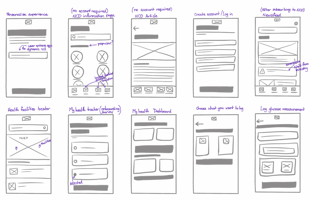
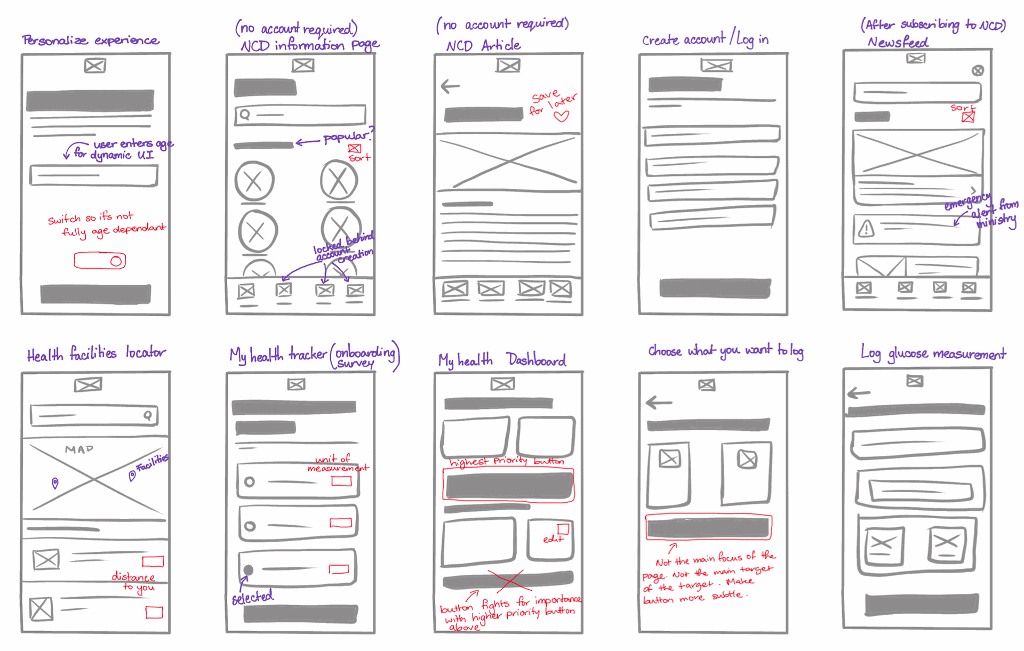
Iterating on the design
Design iteration is a crucial part of the design process, allowing for refinements and improvements based on feedback and evolving requirements.
High Fidelity Wireframes
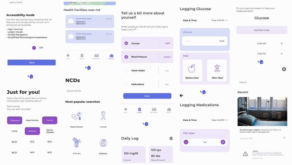
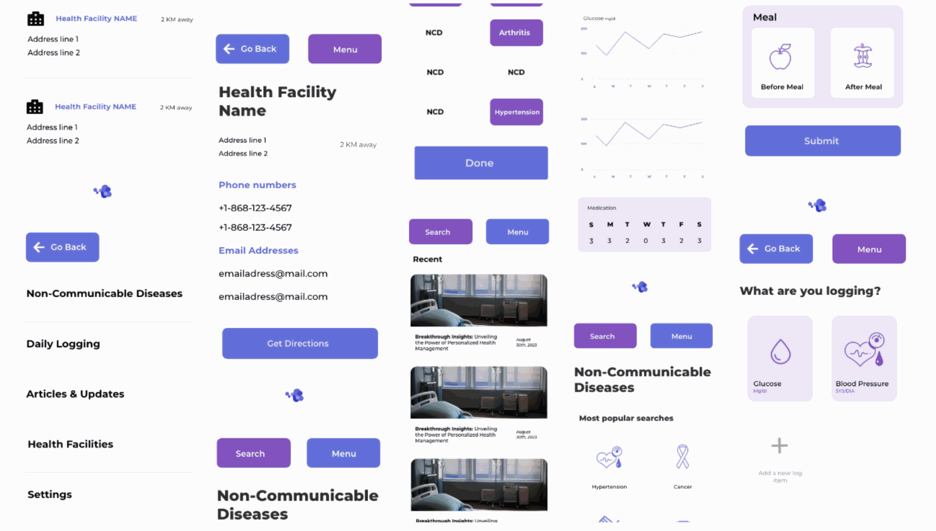
User App (Regular User interface)
These digital renderings build upon the foundational ideas visualized through paper wireframes, now bringing sophistication and accuracy to the forefront. In this section, we delve into the intricacies of our high-fidelity wireframes, exploring how each element is meticulously crafted to enhance the user experience and deliver on the app's objectives.
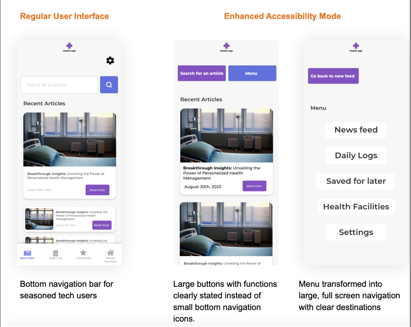
User App (Enhanced Accessibility Mode)
Accessibility lies at the heart of our commitment to inclusivity in the HealthConnect TT app. In this section, we shine a spotlight on how we've meticulously designed and implemented features to ensure the platform is accessible to users of all abilities. From intuitive navigation to adaptable font sizes, our focus on enhanced accessibility goes beyond compliance—it's about creating an environment where every user, regardless
of physical or cognitive differences, can seamlessly navigate and engage with the application.
Here is the link to the full design of the User App:
https://xd.adobe.com/view/c9a4c0a9-409e-4666-9571-63928dbd3259-9cf7/grid/
Accessibility Considerations
Color Contrast and Visual Clarity
Our design prioritizes color contrast, benefiting users with visual impairments. Clear distinctions between text and background elements enhance readability and contribute to a more user-friendly experience.
Enhanced Accessibility Mode
Pushing the boundaries of user-centric design, our innovative approach introduces an dynamic interface that addresses users’ technological familiarity. This feature ensures an intuitive and personalized experience that resonates with users’ disabilities and
preferences.
We empower users with the freedom to toggle and customize the interface according
to their unique needs and choices.
Enhanced Accessibility Mode
The Enhanced Accessibility Mode Interface allows for the articles to be big and easily readable. The font size is larger and the articles are easier to navigate and click into as they are all large. The Menu has also been changed from a bottom navigation to a full screen and clear menu navigation.
Conclusion
In conclusion, the designs developed during this phase represent a culmination of user-centric insights, stakeholder input, and iterative refinement. These designs have been transmitted to the developer for implementation, marking the transition from conceptualization to execution.
Through ongoing collaboration and dialogue with the developer, additional criteria and feedback will be incorporated to further enhance the interface's usability, functionality, and overall effectiveness.
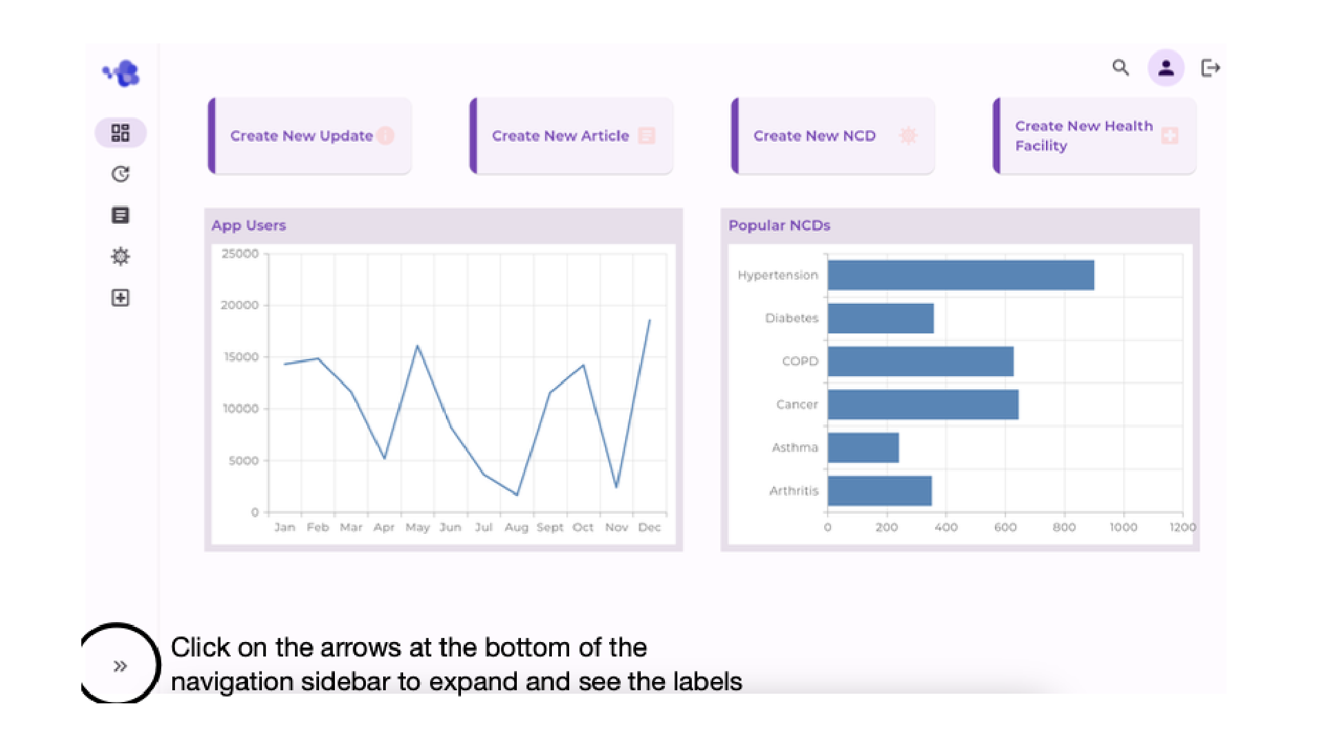
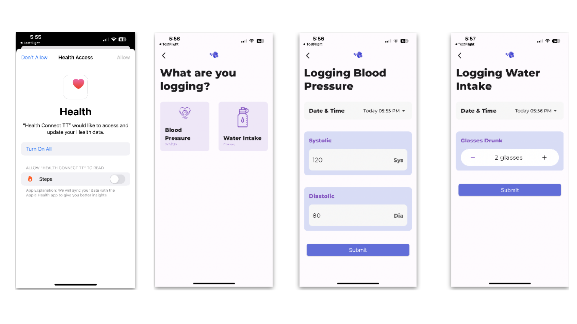
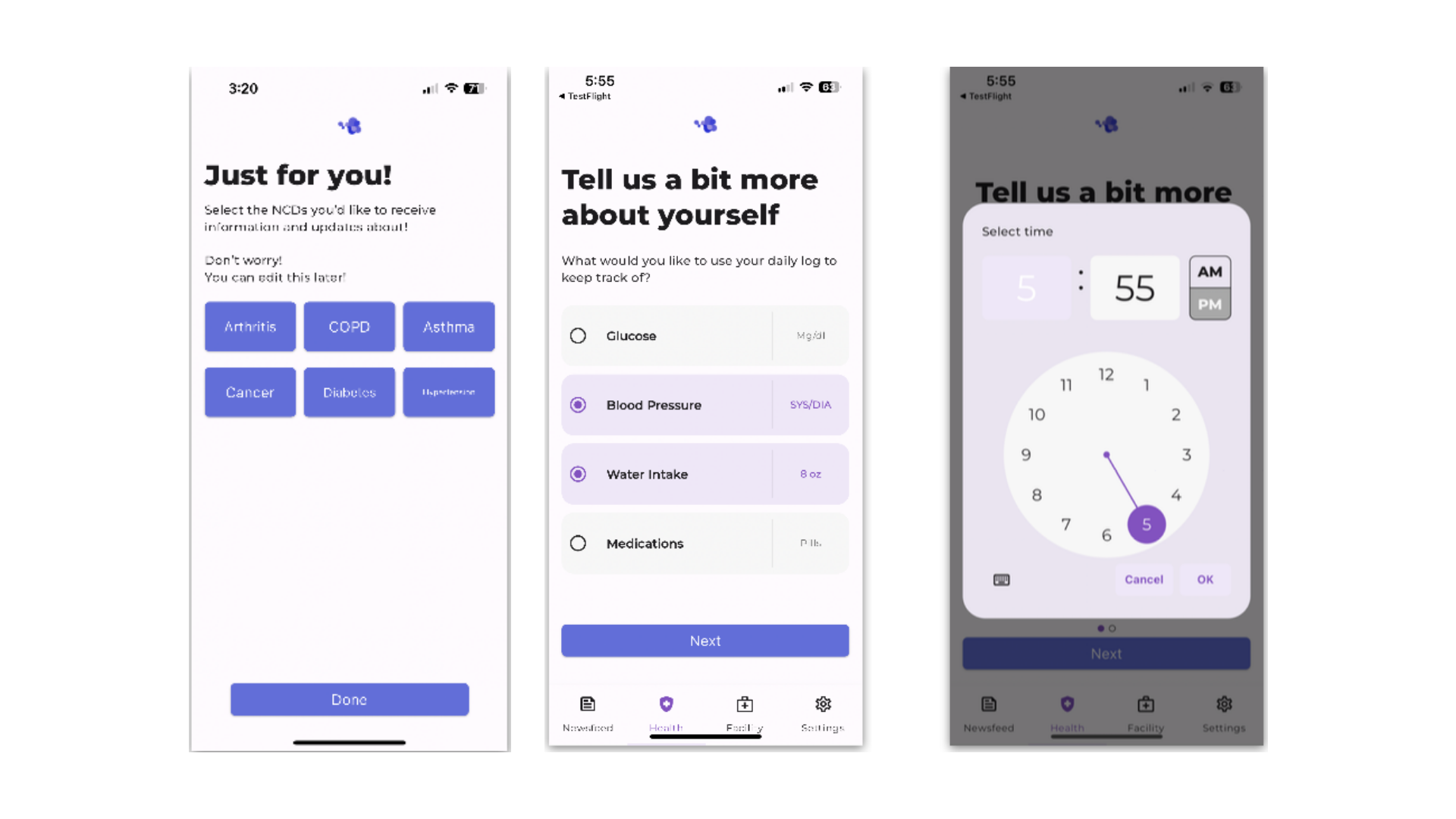
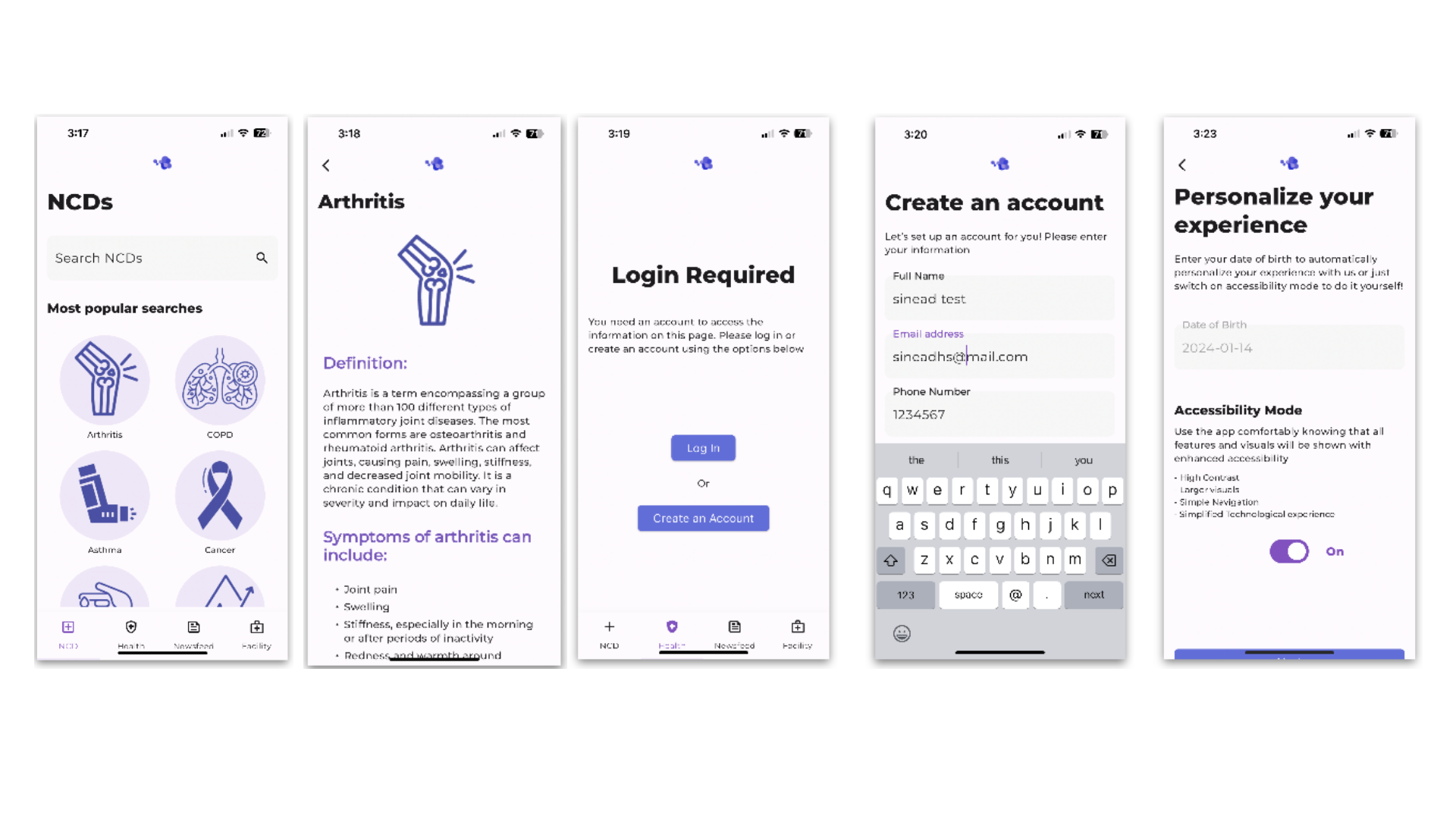
A peek at the completed app!
These are some screenshots from the final developed app!